You finish a vertical video, upload it and discover that the like button covers the last word of every caption. On another platform, the description sits over the speaker's hands. The call to action that looked perfectly aligned in the editor appears behind the account name.
The video is still 1080 by 1920. Nothing is technically outside the frame. The problem is that the full frame is not equally usable.
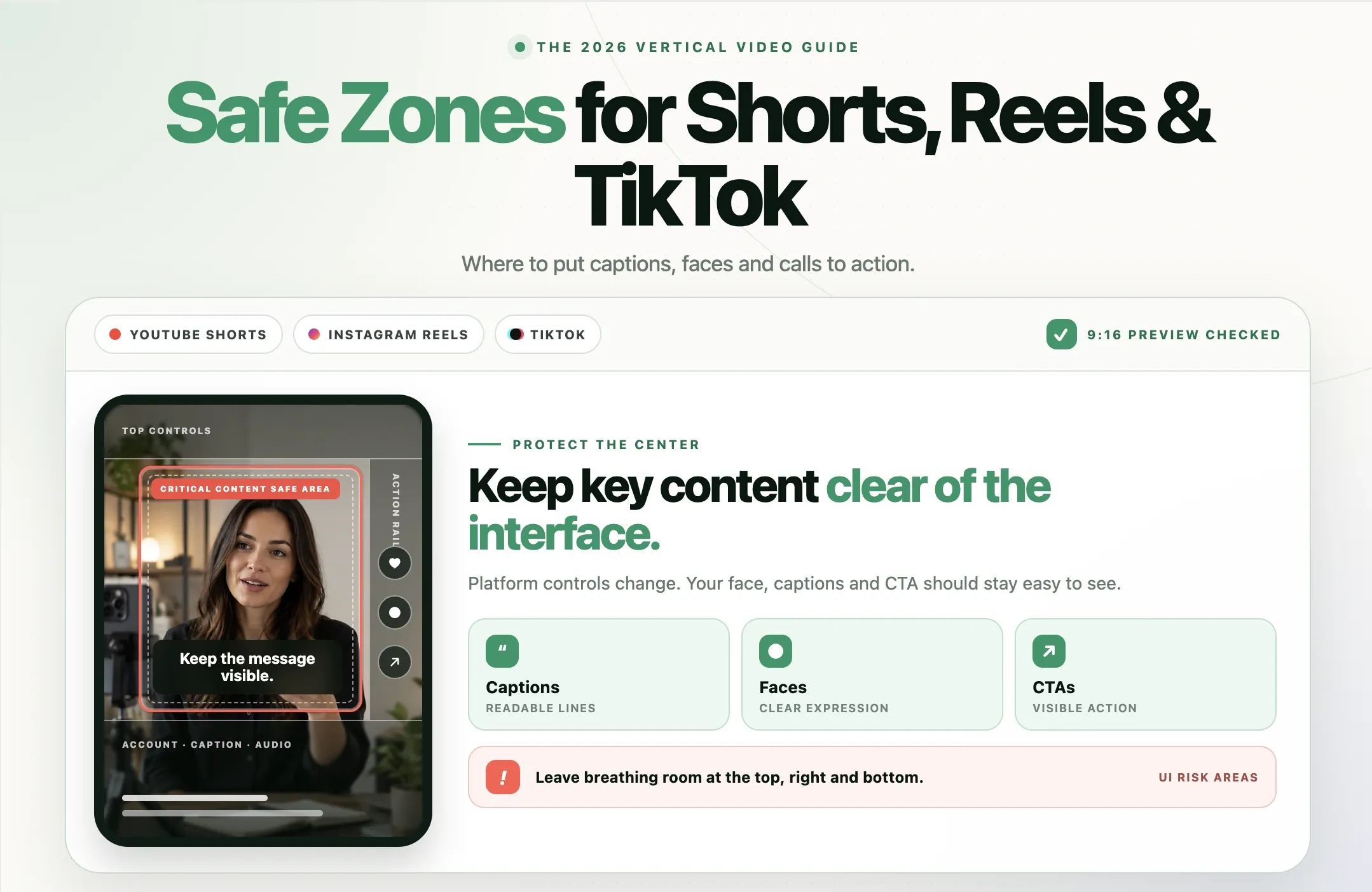
YouTube Shorts, Instagram Reels and TikTok place controls, captions, account information, audio labels and other interface elements over vertical video. Those overlays do not become part of your exported file, so they are easy to miss while editing. A safe-zone workflow protects the parts of the video that viewers need to read or recognize.
Quick answer: Create a 1080 by 1920, 9:16 video and keep critical text, faces, logos and calls to action in the central area. As a conservative cross-platform starting point, leave about 10 to 15 percent clear on the sides, 15 percent at the top and 25 to 35 percent at the bottom. Treat these as working margins, not official universal specifications. Preview every final upload because interfaces vary.
This guide explains the YouTube Shorts safe zone, Instagram Reels safe zone and TikTok safe zone without pretending there is one permanent pixel box for all three apps. It separates official platform guidance from practical editing recommendations, then shows how to build a reusable workflow in Reap.
What is a safe zone in vertical video?
A safe zone is the part of a video frame where important content is less likely to be covered by interface controls or lost to a different crop. It is where you place information that must remain understandable: captions, faces, product details, logos, prices, disclaimers and calls to action.
The area outside that zone is not forbidden. It can hold backgrounds, scenery, decorative motion and other details that are not essential to the message. The point is to avoid putting a critical word underneath a button or placing the only view of a product behind a description panel.
Google's Universal Video Ad Safe Zones document describes the problem directly: overlays, calls to action and buttons appear in different locations depending on the format, campaign type and screen. Google recommends keeping critical elements such as logos, products and on-screen text inside a safe area, while also warning that device differences prevent a complete guarantee.
That document is for advertising inventory, not a permanent specification for every organic Short. The production principle still matters: visible pixels and reliably unobstructed pixels are not the same thing.
Text-safe and action-safe areas are different
Editors often need two levels of protection:
- Text-safe area: A tighter central region for words, logos, prices, subtitles and legal disclosures that must be readable.
- Action-safe area: A slightly wider region for faces, gestures, products and demonstrations that should remain understandable even if an edge is partially obscured.
A background shelf can extend behind the TikTok action rail. A person's eyes, the button they are pressing or the word completing a CTA should not.
Why there is no single universal safe-zone template
A 9:16 export gives the platforms the same canvas shape, but it does not give them the same interface. Even within one app, what covers the video can change.
- A paid placement may add a CTA button that an organic post does not have.
- A shopping-enabled post may add product information.
- A long description may occupy more vertical space than a short one.
- Viewer controls can differ by device, operating system, account or staged rollout.
- The feed preview, full-screen player and profile grid may crop the same upload differently.
- Accessibility settings and text scaling can change how interface labels appear.
YouTube itself changed the Shorts viewing experience in June 2026. The company introduced an optional Clear Screen mode that hides overlays, along with revised playback and feedback controls. YouTube's announcement is a useful reminder that interface design evolves. Because Clear Screen is a viewer choice, a creator should not assume every viewer will activate it.
The safest approach is to use a conservative shared zone for the elements that absolutely must survive, then preview platform-specific versions when the video includes a strong CTA, small product detail or mandatory disclosure.
A practical 1080x1920 safe-zone starting point
For a standard vertical export, use a canvas of 1080 pixels wide by 1920 pixels tall. The following margins are Reap's conservative editorial recommendation for a first cross-platform cut. They are not official organic-post specifications from YouTube, Meta or TikTok.
|
Frame area |
Working margin |
What to keep out |
|---|---|---|
|
Top |
About 15% |
Headline endings, faces, logos and small disclaimers |
|
Right |
About 10% to 15% |
Caption text, CTAs and the important part of a gesture or product |
|
Left |
About 10% to 15% |
Text that would feel cramped or vulnerable in alternate crops |
|
Bottom |
About 25% to 35% |
Captions, URLs, prices, buttons and required disclosures |
|
Center |
Primary working area |
Keep the main message, face, product and CTA here |
These margins are deliberately cautious. The bottom receives the largest buffer because it commonly holds the account name, post caption, audio information, navigation and commercial controls. The right side commonly holds reaction and sharing controls.
You do not need to place every element inside a small rectangle. Give text the tightest protection, let faces and gestures use more of the frame, and allow decorative backgrounds to reach every edge. If the composition becomes cramped, create separate platform versions instead of shrinking everything until it is unreadable.
Important distinction: Meta, Google and TikTok publish safe-zone resources primarily for ads. Those are valuable production references, but they should not be presented as permanent pixel rules for all organic Shorts, Reels or TikToks.
YouTube Shorts safe zone
A YouTube Short normally displays a vertical stack of engagement controls along the right side. Lower areas can show the channel, title, sound and other playback information. Controls can change when viewers pause, open comments or use another Shorts feature.
Where to place captions on YouTube Shorts
Keep burned-in captions away from the far right and the bottom metadata region. A central lower-middle position often works, but move the captions upward if a second line would enter the interface area. Test the longest two-line caption, not only the short first sentence.
If a video also uses a lower-third name, product label or progress bar, build a hierarchy. Captions need a consistent reading position. The lower third can appear briefly above or below them, provided neither element covers the speaker's mouth or the demonstrated action.
Where to place faces and products on YouTube Shorts
Frame a talking head near the vertical center with comfortable headroom. Avoid placing the face directly under top labels or so far right that the action rail competes with the eyes. For a two-person podcast, use a composition that keeps both active speakers in the central action-safe area.
For product demonstrations, keep the part being touched or changed away from the right edge. A product can extend into the unsafe area, but the feature being discussed should remain visible in the core.
Do not depend on Clear Screen mode
Clear Screen can give a viewer an unobstructed look at a Short, but it does not replace safe-zone editing. Most viewers encounter the standard interface first. If the hook, subtitle or CTA is hidden at that moment, the optional clean view arrives too late to solve the problem.
Instagram Reels safe zone
Instagram Reels usually place engagement controls on the right and account, caption and audio information near the bottom. Additional labels can appear at the top, while shopping, collaboration, sponsorship and ad features may introduce more interface elements.
Meta's official Reels advertising guidance recommends native 9:16 video with audio and says key messages should remain in the safe zone. Meta also provides a Reels ad safe-zone checker. That tool is designed for paid creative, so use it when a Reel will become an ad, then still preview the organic version separately.
Where to place captions on Instagram Reels
Keep captions in the central portion of the video and above the account and description area. Do not align the last word against the right edge. If captions animate one word at a time, verify that the widest highlighted word remains inside the protected area.
Instagram's native caption sticker and burned-in subtitles can both be useful, but avoid displaying two competing caption systems. If you publish a captioned export, preview the Reel before sharing and make sure Instagram has not added another automatic layer that reduces clarity.
Playback safe zone vs cover crop
The full-screen Reel and its profile-grid cover are different design problems. A title that is safe during playback can still be cropped in a grid or feed preview. Choose a dedicated cover where the publishing workflow allows it, and keep its title centered enough to survive the relevant preview crop.
If a thumbnail is important to discovery, treat it as a separate asset rather than a random frame from the video. The same principle applies to YouTube, where the workflow in our guide to adding a custom thumbnail to YouTube Shorts can help you plan the cover separately from the playback composition.
TikTok safe zone
TikTok also places interaction controls on the right and creator, caption, sound and navigation information near the bottom. Search, Shop, advertising and other product features can add more controls, which is why a single old screenshot is not a reliable permanent template.
TikTok's official Creative Center guidance says the For You feed contains fixed interface elements that can block creative and recommends keeping the product and important elements in the safe zone. The guidance is written for advertisers, but the visibility problem also explains why organic editors should protect critical content.
Where to place captions on TikTok
Use the central horizontal area and avoid the lowest quarter of the video for essential text. If the creator's own caption is long, the visible interface may occupy more room. Place burned-in subtitles high enough that they remain readable, but not so high that they cover the subject's eyes.
TikTok text overlays placed inside the app can show placement warnings, but an exported caption layer does not receive that help. Build the safety margin during editing, then make a private or draft upload and inspect it on the account that will publish.
Plan extra room for Shop and ad controls
A TikTok intended for commerce may need to accommodate product cards, disclosure labels or CTA controls. If conversion is the goal, do not put a price, discount code or product name in the same area as those controls. A platform-specific commerce version is often better than one compromised master.
Safe-zone comparison for Shorts, Reels and TikTok
|
Platform |
Common interface risk |
Conservative editing response |
|---|---|---|
|
YouTube Shorts |
Right-side actions; lower channel, title and sound information; changing playback controls |
Keep captions central, protect the lower area and do not rely on optional Clear Screen mode. |
|
Instagram Reels |
Right-side actions; lower account, caption and audio; top labels; separate feed and grid crops |
Protect central text, make a deliberate cover and recheck any boosted or ad version. |
|
TikTok |
Right-side actions; lower caption, sound and navigation; Shop or ad additions |
Raise critical captions, reserve more bottom space for commerce and test a draft upload. |
The overlap is useful: all three reward a strong central composition with generous right and bottom margins. The differences matter when the content depends on fine print, product tags, app-native stickers or a specific preview crop.
Where should captions go in a vertical video?
Caption placement is not only a geometry problem. Viewers need to read the words while also following the face, demonstration or B-roll.
Use the lower-middle area as a starting point
Lower-middle captions feel connected to speech without sitting in the app's bottom interface. Raise them when the lower area contains a product, hands or a native CTA. Move them slightly lower when the top and middle contain a screen recording or diagram.
Keep line length short
One or two short lines are easier to protect than a wide paragraph. Break captions by meaning, not at arbitrary character counts. A phrase such as “Check the export before posting” is easier to scan than three lines that split the verb from its object.
Design for the widest word and the busiest frame
A caption style can look safe on “Try this” and fail on “internationalization.” Scrub through the entire video and inspect the widest phrase. Also check moments when B-roll, a speaker label and captions appear together.
Protect contrast as well as position
Text inside a safe zone can still be unreadable over a bright shirt or changing background. Use a background plate, shadow, outline or sufficiently opaque caption box. If a word highlight changes color, make sure both the normal and highlighted states meet the same contrast requirement.
For a fuller accessibility and workflow comparison, see subtitles vs closed captions on social media and the step-by-step guide to adding captions to YouTube Shorts.
How to frame faces, hands, products and screen recordings
Faces need breathing room
Auto reframing can keep a speaker visible, but a close crop may leave no room for platform controls or captions. Preserve enough headroom and side space for the face to remain comfortable after the final vertical crop. In a conversation, switch the crop when the active speaker changes instead of squeezing two distant people into a tiny frame.
Hands are part of the action
For tutorials, cooking, crafts and product videos, the important action may happen below the face. Reframe around the task, not only the person's eyes. Move captions away from the hands during a demonstration, then return them to the usual position afterward.
Crop screen recordings intentionally
A full desktop screen reduced to phone width is rarely readable. Crop to the relevant control, enlarge it and use a pointer or highlight when needed. If the interface changes across steps, animate the crop or cut between close views. Keep the button being demonstrated out of the platform's own right-side controls.
Use B-roll to simplify a busy frame
A well-chosen cutaway can make a key point easier to see than stacking another label over a talking head. Reap lets users search for and add image or video B-roll inside the editor. The guide to using B-roll in Shorts, Reels and YouTube videos explains how to choose supporting visuals without turning them into unrelated decoration.
How to create safe-zone-friendly clips in Reap
A safe-zone check works best as part of the edit, not as a repair after every caption, logo and product label has been placed. Reap can help creators turn a long recording into short clips, reframe the footage for vertical delivery and refine captions before export.
- Upload the source or add a supported link. Start with the full podcast, interview, webinar, lesson or other recording.
- Generate candidate clips. Choose moments that deliver a complete idea rather than forcing every clip into the same length.
- Set the orientation to 9:16. Use a 1080 by 1920 vertical canvas for a full-screen Shorts, Reels and TikTok master.
- Review the automatic reframe. Make sure the active speaker, product or demonstration remains in the central action-safe area. Reposition the crop where the subject changes.
- Generate and correct captions. Fix names, technical terms and punctuation before styling the text.
- Place captions conservatively. Keep the longest line away from the right-side controls and bottom metadata area. Adjust placement when it covers a face, hand or product.
- Add supporting visuals carefully. Search for image or video B-roll when a cutaway clarifies the message, then check its crop and any text it contains.
- Add branding and CTAs. Keep logos, offer details and CTA language inside the protected central area. A CTA that cannot be read is not useful.
- Export and preview each destination. Upload a draft, private or unlisted version where possible, then inspect the real app interface before publishing.
Reap's Auto Reframe can resize and reposition a source for vertical, square and landscape versions. The Reap Editor adds frame-level caption control, text overlays, B-roll and other finishing tools. The editor helps you place the content, while the final platform preview confirms whether that placement survives the live interface.
Practical rule: Keep one clean 9:16 master, then duplicate it when a platform-specific CTA, commerce feature, caption position or cover crop requires a different version.
Can one video work across all three platforms?
Yes, when the composition is simple and the key content stays in a conservative central zone. A centered talking head with compact captions and no app-specific CTA can often travel well across YouTube Shorts, Instagram Reels and TikTok.
Create separate versions when:
- The CTA names a platform-specific action such as “tap the product link.”
- An Instagram Reel will also be used as a paid ad.
- A TikTok uses Shop controls or a long on-platform description.
- A YouTube Short needs a different cover, title treatment or channel-specific ending.
- The original crop cannot keep two speakers or a demonstration visible on every platform.
- A required disclaimer becomes too small inside the shared zone.
Cross-posting is not the problem. Publishing an unreviewed identical export is. Reuse the core story, then adapt the interface-sensitive details.
Common safe-zone mistakes
Putting captions at the very bottom
Bottom alignment may feel natural in a traditional video player, but short-form platforms use that area heavily. Raise the caption block and confirm its lowest two-line state.
Using the entire right edge for text
A wide headline can run directly beneath reaction controls. Reduce the line length, narrow the text box or move the headline toward the center.
Centering every element on the same point
Safe does not have to mean stacked. A face, caption and CTA can all occupy different positions within the central area. Use visual hierarchy so the frame remains readable.
Shrinking captions until they fit
If a text block only fits by becoming tiny, rewrite it. Shorter language, a line break or a separate end card is better than unreadable copy.
Checking only the first frame
Subjects move, caption lengths change and B-roll has different compositions. Review the entire video, especially the longest caption and the final CTA.
Confusing ad guidance with organic specifications
Official ad templates are useful because they account for overlays, but an organic interface may look different. Label ad measurements accurately in your production documentation and preview both placements.
Assuming safe placement guarantees performance
A visible caption cannot rescue an unclear hook or repetitive edit. Safe zones remove one source of friction. Topic relevance, pacing, delivery and viewer satisfaction still determine whether the video earns attention. Our 40 video editing tips cover the wider workflow, while the guide to choosing the best video length explains how to test duration with retention data.
Pre-publish safe-zone checklist
- Export at 1080 by 1920 in 9:16 unless the destination calls for another format.
- Keep critical text and logos away from the top, right and bottom interface areas.
- Check the longest caption at its widest animation state.
- Make sure captions do not cover the speaker's mouth, hands or the product feature being discussed.
- Keep mandatory disclosures large enough to read and visible long enough to understand.
- Review every B-roll crop and screen recording on a phone-sized preview.
- Create a separate cover or thumbnail for feed and profile-grid crops when needed.
- Check organic, boosted and paid versions separately.
- Upload a draft, private or unlisted test in each destination app.
- Repeat the check when a platform changes its interface.
The best safe zone is a repeatable review habit
There is no perfect rectangle that permanently solves YouTube Shorts, Instagram Reels and TikTok. The apps use different controls, add new features and display content across many screens.
There is a reliable process: start with a full 9:16 frame, protect a conservative central area, give captions room, keep the important action visible and preview the real upload before publishing.
Use one shared master when the design is simple. Create platform-specific versions when a CTA, shopping control, paid placement or cover crop changes the available space. Reap can handle the clipping, vertical reframing, captions, B-roll and finishing work, so the safe-zone review becomes a focused final check instead of a complete rebuild.
Create a vertical clip with Reap, then inspect it in the interface where viewers will actually watch it.